Topics:
Never Miss a Beat - Get Updates Direct to Your Inbox
FILTER:
The 8 Elements of a High-Converting Ecommerce Product Page
By Quiet Light
Conversion rate is one of the most important metrics that any Ecommerce store can track. Research shows that only around 5% of total visitors end up making a purchase – and that’s if you’re lucky. Doing your very best to ensure that the majority of visitors have a positive experience will move that needle in the right direction.
What should a page look like to ensure the highest possible number of conversions? In this article, we take a look at eight elements of a high-converting product page, as well as how you can implement these elements in your own store.
Explainer Videos
Product pages that have explainer videos are much more likely to convert. Search engines favor video content and will show it for over 70% of the top 100 search listings. Video is also much more likely to improve time on page, boosting your overall SEO score too.
Buy a Profitable Online Business
Outsmart the startup game and check out our listings. You can request a summary on any business without any further obligation.
However, that’s not the main reason to include videos on product pages. A good video will always speak much louder than any product copy you can create. It will show the product from all angles and in real life, enabling users to better grasp its size. Now, that’s something not even a product image can always do well.
An explainer video will take it a step further. It will:
- show how a product can or should be used
- highlight its benefits and different applications
- help customers understand what they can expect
This feature can instantly make your product pages significantly more valuable than your competitors’, who may have failed to utilize this content format.
Let’s take a look at an example. Bay Alarm Medical features a video that explains how their mobile alarm system works and what the benefits of using it are. They go on to demonstrate the use of the product and show the viewer what they can expect from the purchase.
 Image source: Bayalarmmedical.com
If your own store has more than one product, it will be a challenge to film a video for each one. But you don’t necessarily have to do that anyway. Instead, just focus on creating videos for your most popular items and the items that get the most queries.
Remember: your goal is to help a customer understand the benefits and features of the product, not to sell it to them. Refrain from using overly promotional language, and focus on being as useful and helpful as you can possibly be.
High-Impact Calls to Action
The CTA is often hailed as the most important element of a product page. However, this premise isn’t necessarily true. The best CTA in the world won’t make up for a poorly constructed and written page, but an unmotivating CTA will also result in fewer conversions.
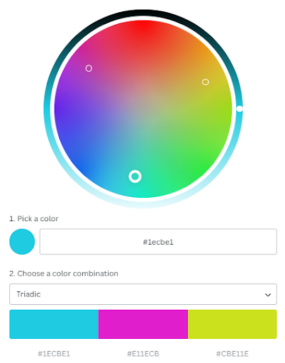
High-impact CTAs are clearly visible and yet manage to blend into the rest of the page. Ideally, they should be picked from a selection of options calculated by a color wheel. This ensures maximum visibility without the risk of compromising the page’s design.
Good CTAs are also short and to the point. They use action-packed words that tell a user what to do and what the result of that action will be. They aren’t sales-oriented but rather focus on branding and inspiration.
Adding some supporting text near the CTA can help you combat the scarcity issue and add more relevant information. All the CTAs you place above the fold thus need to blend in with the surrounding copy. They’ll be highlighting your key value proposition and demanding a specific course of action from the visitor.
Ideally, the CTA should be the most compelling clickable element visible to the user. Try to avoid having too many actionable UI items competing for the user’s attention. However, there are scenarios where two CTAs can work. For example, if you have an add to cart and an add to wishlist CTA.
Here are two examples that will show you what you should be aiming for. While neither of them are product pages, the CTAs themselves encompass ideal design practices.
Touchland has a minimalistic white CTA that blends in with the rest of the page marvelously. Its main appeal lies in the wording. “Get yours” is probably one of the better copywriting solutions you can emulate, as it speaks directly to the customer.
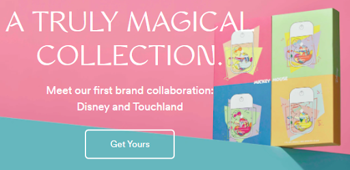 Image source: Touchland.com
Smartlook’s CTA is much more vibrant, and they’ve also added the “no credit card required” element, which is super-helpful and a significant conversion booster itself.
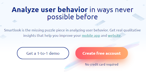 Image source: Smartlook.com
Your goal is to find a blend of these various elements that will speak to your audience and get them to click.
Transparent Shipping Costs
Nearly 50% of customers have listed shipping as one of the main reasons they have abandoned their shopping carts. This should come as no surprise – we’ve all seen extortionate shipping costs as customers ourselves. When the shipping is more than the actual product, it’s very hard to justify a purchase.
As an ecommerce store, what you can do is simple: be upfront about the costs of shipping. While you will naturally need to get some basic delivery information from your shoppers before you can give them a viable estimate, make sure that shipping costs are a part of your payment breakdown.
This is how Natasha Denona and most other ecommerce brands do it. They give you a shipping cost at checkout, which is based on the amount of money your cart is worth and the quantity and weight of the items you’ve ordered.
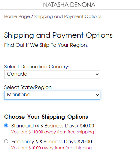 Image source: Natashadenona.com
Most brands will have a fixed shipping rate and offer a free shipping option after you’ve spent a specific amount. This is certainly your best course of action, and it’s what most shoppers are used to.
An extra step you can take for users who have logged into their accounts is to offer a shipping estimate before they hit checkout. As their cart is updated, since you already know their shipping address, you can offer information on shipping costs and notify them of the amount they still need to spend to qualify for free delivery.
Detailed Delivery Information
While we’re on the subject of shipping, you should also aim to provide as precise a delivery date as possible.
Sometimes customers will specifically want to get their package before a certain date. For example, they might be buying a present and need to know if the delivery will arrive on time. If they have to show up at the party empty-handed, chances are they’ll never shop with the same brand again.
Thinking of Selling Your Business?
Get a free, individually-tailored valuation and business-readiness assessment. Sell when you're ready. Not a minute before.
True, you’ll never be able to control the shipping process yourself – especially if you offer worldwide delivery. The pandemic has certainly taught us that estimates may and often will be subject to unforeseen circumstances. But as a brand, it’s up to you to handle them in a way that doesn’t unduly impact customer experience.
Take a look at the ingenious solution Somnifix offers. They give you a precise estimated shipping timeline and highlight how long your money-back guarantee will be valid. This simple widget not only helps customers understand delivery times but also serves as a subtle hint that the brand cares about them as users. Because Somnifix is dedicated to its customers, it doesn’t offer 30-day guarantees from the moment of shipping but the moment of arrival.
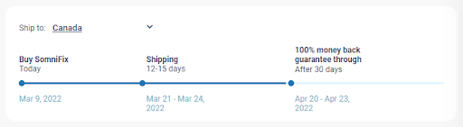 Image source: Somnifix.com
In short, providing details regarding shipping can increase your conversion rates. When you’re transparent about shipping information, your customers no longer have to make their own assumptions about potential arrival dates, so they can make purchasing decisions accordingly.
High-Value Social Proof
Adding some social proof to your product pages is a great way to inspire more conversions. However, social proof has now become so commonplace that it can be difficult to stand out and actually put your reviews to good use.
While shoppers will certainly like to see a review or a testimonial, they will no longer be as swayed by them as most brands have started implementing them. Also, there remains the fact that it’s quite easy to fake certain kinds of social proof. Therefore, unsurprisingly, a lot of social proof is less trustworthy than it used to be.
If you take your social proof game to the next level, you can expect some significant conversion rate improvements. Here’s what we have in mind.
Like most brands, Gili Sports features product reviews on their product pages. However, what makes theirs stand out is the amount of information you can get about the reviewer’s own experience with the product.
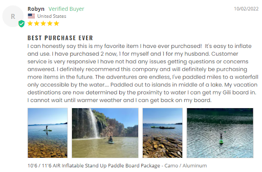 Image source: Gilisports.com
You get to know where the customer is from, and many of them have talked at length about their use of the paddle board, where they’ve taken it, what they liked about it, and so on.
The shopper is able to relate to the reviewer and their adventures and lifestyle. Plus, they’re also likely to experience a bit of FOMO, looking at all those amazing paddle board images that accompany a lot of the reviews.
There is a genuine community brewing in this review section. Satisfied customers are helping future customers make a purchasing decision and compelling them to enter a cool world of adventure.
Trust Badges
One of the main obstacles every online store needs to overcome is a lack of trust. If you are a new brand (or at least new to a shopper), they’ll have zero reasons to trust you. What do they know about you, after all?
Even if you display plenty of information about your company, most customers will have no way of verifying that information. And they may still be hesitant to give you their personal, and most importantly, their financial information.
A good way to overcome these hesitations and concerns is to feature trust badges on your product pages. They will show that you care about your customer’s safety and experience and that you take them seriously, understanding what they may be afraid of.
No matter what you are selling, you will be able to offer a variety of trust badges. You can use them to:
- guarantee the quality of the product
- offer a warranty
- provide an easy way to return a product
- show that you will cover the costs of the return
All of this information will go a very long way to help boost conversions. But most importantly, you’ll want to use trust badges to address the concern of data privacy and transactional security. A simple (but high-end) SSL certificate and the badges of all the payment methods you accept are crucial elements of a high-converting ecommerce product page.
Knockaround has done a great job of summarizing these key trust elements in four illustrations. They offer free shipping and returns in the US, guarantee your satisfaction, and refer to themselves as the original.
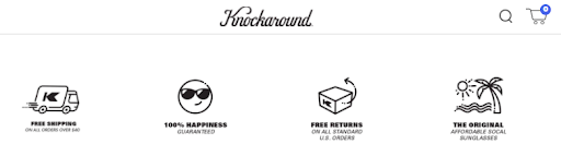 Image source: Knockaround.com
By putting their own twist on these trust badges, they’ve also ensured that they are on-brand and made the entire element more personalized.
A Diverse, Immersive Gallery
We’ll go out on a limb here: the most important element of a product page is the image gallery.
After all, a customer will want to know exactly what they are buying. They’ll want to know what a product looks like and what it is like. If you only give them a couple of generic images with a white background, they won’t be as inspired to make that purchase.
On the other hand, the more informed a customer is, the more comfortable they will feel to proceed with checkout. They’ll have fewer hesitations and questions, and they’ll better understand how a product will fit into their lifestyle.
This is why you should show your products in all their guises. Show the product:
- while it’s still unpacked, so customers can see the packaging
- being worn or used
- on a shelf or how it may be stored
- from all angles and in as many different scenarios as possible
Seeing a product in action will always impart plenty of information on the way it behaves when used, which is what all shoppers ultimately want to know. If a shirt gets creased two minutes after you put it on, they may still want to buy it, but they will want to be aware of this fact prior to purchase.
This tactic applies to all manner of products, and not just clothing. Even a mug will look much more appealing when shot in use.
Take a look at how Rain or Shine Golf applies this principle. They show their products being used in different ways and different situations and explain what all the options and benefits are with the use of images. This lets them impart much more valuable information without having to describe everything in extensive detail.
 Image source: Rainorshinegolf.com
Always remember that your product gallery is supplemental to product descriptions and specifications. Don’t make the mistake of expecting shoppers to draw conclusions about the product based on the image gallery.
Intelligent Customization
Finally, you’ll need to make sure that all customization options are clearly highlighted and show customers what the final product will actually look like. Don’t expect them to get in touch with you to find out how the customized product is going to look. If you want them to convert, they need to see the end result immediately.
Luckily, technology now allows you to solve this issue quite easily. You can let customers upload an image or enter the text that they want to incorporate in your product, for example.
Take a look at Real Thread. Their interface lets you drag and drop the image you want to add to one of their custom shirts, and you can immediately see what the product you get in the mail will look like. You don’t have to worry about the brand getting it right.
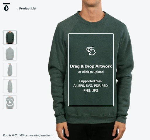 Image source: Realthread.com
The same principle is used by Sephora’s Virtual Artist app, which lets you try makeup on your virtual self before you make a purchase. In the beauty world, this option is practically priceless. It saves shoppers a lot of waste and makes for an amazing customer experience.
While you may not be able to afford an AR solution, consider how you can best showcase the end result of customization to help your shoppers feel more at ease.
Final Thoughts
Product pages that convert all have three things in common. Firstly, they offer enough information to eliminate all the obvious points of doubt. Secondly, they clearly highlight the value behind a product. And lastly, they compel a shopper to take the next step towards conversion.
It’s relatively easy to design an adequate product page. But the cutthroat nature of the ecommerce industry means that “good enough” seldom is good enough.
If you want to do more than survive in this space – if you want to thrive – you have to get comfortable with going the extra mile when designing your site’s most important pages. And few (if any) pages are as important as the ones that present your products to the world.