Topics:
Never Miss a Beat - Get Updates Direct to Your Inbox
FILTER:
The Elements of a Successful SaaS Pricing Page
By Quiet Light
How your SaaS pricing page looks and performs can tremendously impact the success of your website in converting web visitors into customers. This is true regardless of whether you’re just starting a SaaS business or looking to grow your company’s value for a potential sale.
But the truth about the elements of a successful SaaS pricing page is that no formula will allow you to create a design that guarantees next-level conversion rates. Yes, there are multiple tactics you can employ to improve your site’s performance and potential. But, at the end of the day, the exact components of a high-converting SaaS pricing page depend on several factors. These include the type of products your business offers, your target audience’s pain points and preferences, and the success with which you can combine sales-promoting design features with those that prioritize the customer experience.
Are you looking to enhance the pricing page on your SaaS website? If that’s the case, this article will guide you through the most impactful elements of a successful SaaS pricing page and provide suggestions on how to implement them on your website to boost conversions and drive value.
Thinking of Selling Your Business?
Get a free, individually-tailored valuation and business-readiness assessment. Sell when you're ready. Not a minute before.
Relative Simplicity
One of the most widespread pieces of web design advice is that you should keep things simple. And, sure, minimalistic web design does have its benefits.
In 2012, Google’s research team found that users love simple and familiar-looking websites, which is why many SaaS pricing pages (and sites in general) look almost identical.
But the thing is, every brand has (or at least should have) that one thing that makes it unique. And by sticking to conventional pricing page templates, you’re taking on the risk that your web visitors won’t be able to discern the distinct value offered by your SaaS product.
In other words, while your pricing page should give your prospects the least amount of info to help them make the right purchasing decision, it shouldn’t force you to hold back on essential details that could allow you to convert potential customers with more complex pain points.
For instance, compare the pricing pages of the two brands below.
On the one hand, Aura only offers a single product — its Amazon repricing tool — for which prospects can buy a monthly or annual subscription.
With no feature difference between the two subscription plans, it’s easy for Aura to keep its pricing page minimal. The page plainly shows the benefits of each option. And prospects who need more product information can refer to the table of included features that inform them of what they can expect to receive from their purchase.

Source: goaura.com
On the other hand, a brand like Mural can’t afford to employ the same minimalistic approach as Aura. Seeing that it offers more complex pricing plans, it must ensure that web visitors have all the necessary info to choose the right plan for their needs, which is why it uses a more detailed, 4-column table to present the benefits of each option.
Could Mural have included even more information in each column, perhaps by listing all the features included in the subscription plans? Definitely. But it’s also true that too much data can overwhelm buyers and cause choice paralysis. So, the Mural web design team decided to stick to the basics so the brand wouldn’t lose any precious customers to an overly complex design direction.
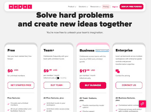
Source: mural.co
Suitable References to Savings
It’s no secret that most customers choose to invest in products that deliver the best value for money. But that doesn’t mean your pricing page should primarily focus on savings.
In fact, a 2021 survey report from Nielsen discovered that people on a tight budget won’t necessarily choose the cheapest product to save money. Yes, 56% of people experiencing financial strain will buy whatever’s on sale to keep within budget. But 63% of those watching their spending will still make purchasing decisions by weighing product benefits.
This data proves that one of the best ways to boost conversions on your SaaS pricing page isn’t to focus exclusively on savings. Instead, know your target audience’s priorities and make sure you highlight the value that will speak to them.
For instance, when targeting end-consumers, know that their buying decisions are more likely to be emotionally driven. B2C customers typically want the product with the highest chance of solving their specific pain points at the lowest cost.
This is why consumer-facing SaaS brands like GetSafe choose to have a relatively prominent reference to savings. In this case, the brand opts for perpetual discount in the form of a seasonal “sale.” This allows GetSafe to make use of an anchor price in their plan-comparison table (more on this later).
Aligning this discount with a season also gives the consumer the feeling that the “sale” is a temporary one, injecting a sense of urgency into their decision-making process. Now, that’s a tactic that’s unlikely to be successful in a B2B context.

Source: getsafe.com
SendInBlue, on the other hand, is a B2B brand that understands its target audience needs solutions that lead to high-quality outcomes. Instead of emphasizing savings or product features, the SaaS pricing page focuses almost exclusively on the prospect’s pain points.
This is why SendInBlue encourages potential B2B customers to specify the number of emails they wish to send per month, using that info to determine the price of the software solution.
Yes, a message informs prospects they can save 10% with a yearly subscription. But all in all, the brand understands that it’s not price that will help it convert customers, but the quality of service it can guarantee.
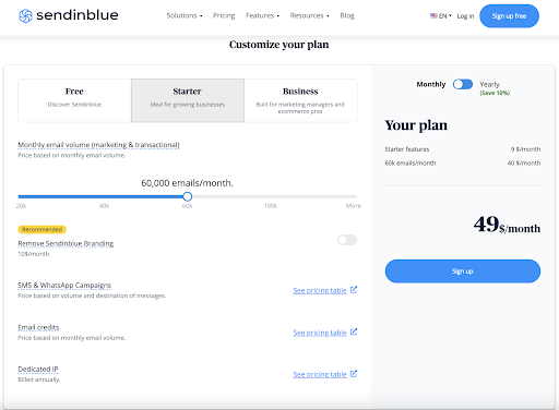
Source: sendinblue.com
Personas
When it comes to the elements of a successful SaaS pricing page, it’s impossible not to mention the factor of your pricing plans’ names.
You see, people want companies to deliver exceptional customer experiences. And, for clients to be happy with your product, you must first ensure they identify one of your plans as the perfect fit for their needs. Although this can be achieved via your sales team — by creating customized plans for every one of your prospects — the better way to get the desired result is to make it easy for your customers to recognize suitable plans based on how they’re described.
By doing something as elementary as choosing the right plan names, you can ensure that your offer attracts web visitors’ attention. And, even more, you can use the copywriting element to guarantee higher customer satisfaction.
For instance, if you check out the Nimbus Platform pricing page, you’ll see that it makes it relatively easy for people to decide whether they need the Free, the Pro, or the Business plan by describing what type of user each of them was made for.
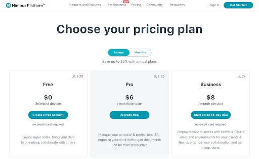
Source: nimbusweb.me
But, for a slightly more creative approach to naming, you could also take inspiration from ChartMogul. This brand names its price plans according to the goals each buyer persona wants to accomplish. The results include options for those who wish to Launch, Scale, or boost Volume.
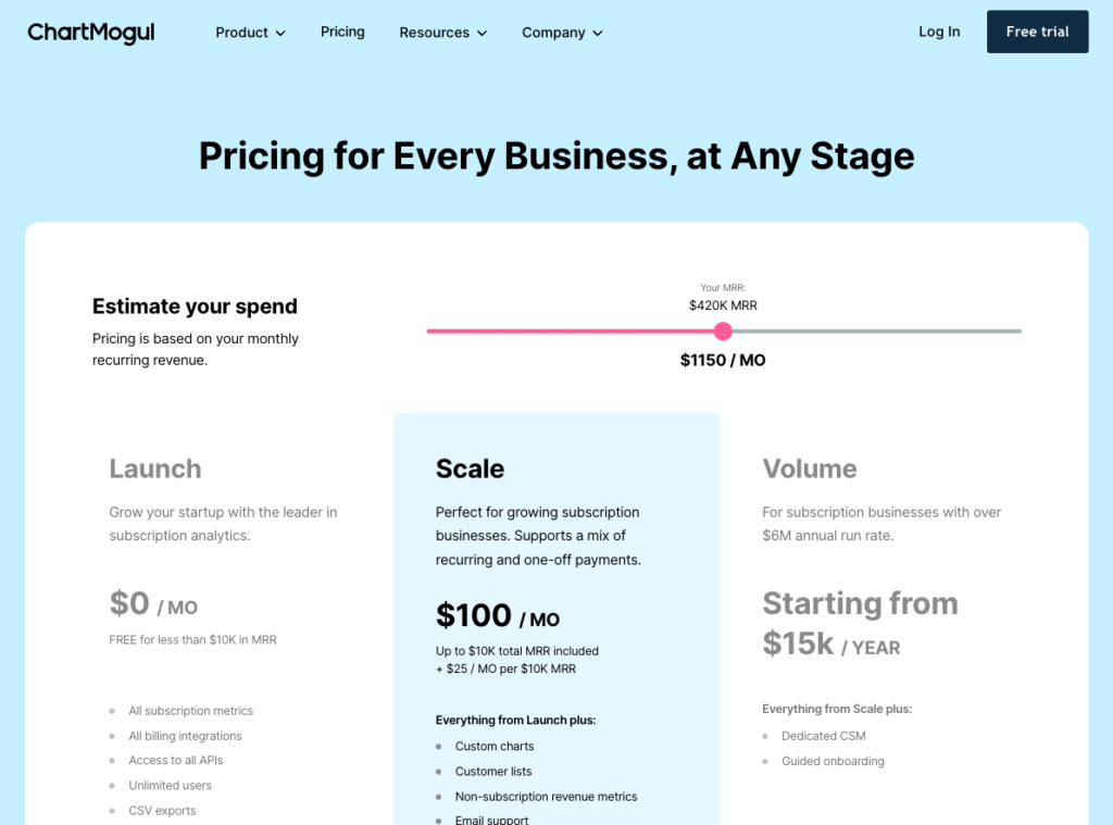
Source: chartmogul.com
Meaningful Plan Comparisons
When selling SaaS products, information is everything.
According to a 2019 report from Gartner, meaningful information delivered at the right moment can make it 3x more likely that your prospects will make a big purchase and not have any regrets later.
So as you explore SaaS pricing page elements that will help you boost conversion rates, customer satisfaction, and your brand’s authority, don’t miss out on the chance to review the type of info you provide. Remember, more is not always better. So, instead of going for quantity when composing plan comparisons, try to prioritize quality.
Yes, detailed information regarding the essential distinctions between different options is something that will allow web visitors to make a purchasing decision they’ll be happy with. But if you take things too far, you risk paralyzing your leads, which might cause them to delay their purchase. Or, worse yet, it might encourage them to buy from your competitors who understand how to present information in a way that benefits users.
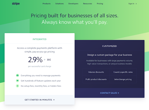
So, to avoid either of these two consequences, ensure that the above-the-fold section of your SaaS pricing page only shows meaningful, conversion-driving information and that it allows your CTAs to stand out.
For instance, if you check out Stripe, you’ll see that the benefits highlighted at the top of the page include assurances like “everything you need to manage payments,” “volume discounts,” “country specific rates,” etc.
Source: stripe.com
Yes, the second screenful of the page describes, in detail, the 100+ features offered by the product. But, knowing what its target audience wants to know, Stripe keeps things simple to avoid distracting web visitors with information that’s not crucial to their decision-making process.
Anchor Pricing
If you’re looking for more advanced pricing page strategies that will drive conversions on your SaaS website, it might not be a bad idea to play around with the concept of anchor pricing.
Essentially, anchoring refers to the practice of determining a monetary reference point that establishes your product’s value in your customers’ minds, then employing various tactics to nudge them toward choosing your preferred plan.
Buy a Profitable Online Business
Outsmart the startup game and check out our listings. You can request a summary on any business without any further obligation.
There are several ways to employ anchor pricing on your website. However, two particular methods have been proven to deliver results for SaaS brands.
The first example of price anchoring comes from Evernote. Here, the initial (anchor) product price is shown and then discounted.
By choosing to continue displaying the original price and the discounted one, the Evernote design team ensures that the brand’s customers understand the product’s value is €8.99 per month for the Professional plan but that they get to use it for a fraction of the cost. It’s a relatively simple technique you can recreate on your site, and it’s particularly likely to work when targeting end consumers.
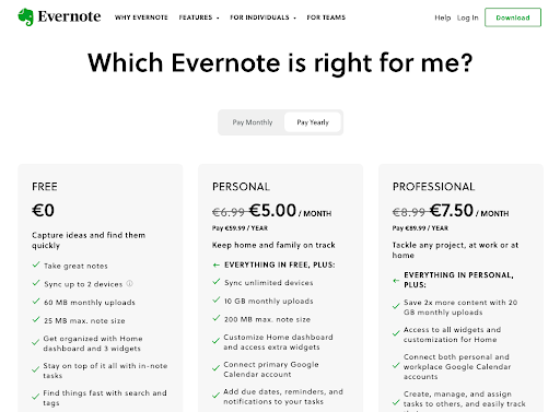
Source: evernote.com
The second way you could implement anchor pricing would be to take inspiration from Hiver.
By presenting web visitors with three price tiers and highlighting the one most likely to meet their needs, the brand essentially surrounds the product it wants to sell with two price anchors. The first is a lower one, which doesn’t offer all the required features. The second is a super-expensive one that’s a bit overkill for most users. Thanks to the approach, the middle tier price seems reasonable and is more than likely to achieve the highest conversion rate, which is Hiver’s exact goal.
Source: hiverhq.com
A Great Reason to Become a Long-Term Customer
In SaaS, customer lifetime value (CLV) is everything. For starters, it paints a clear picture of how well your brand is doing in meeting its customers’ needs. Plus, it can also be an excellent way to:
- Assess your company’s value.
- Measure your customer acquisition cost so that you can gauge the effectiveness of your marketing strategies.
- Evaluate whether your brand is on the way toward steady growth or if you still need to optimize.
Admittedly, CLV is something that you’re most likely to boost by focusing on customer experience (like how long your clients need to wait for a response or how many issues they encounter while using your software). However, there is one thing you can do on your pricing page that can effectively increase CLV: try and convince prospects to become long-term customers from the get-go.
Now, the more common way of doing this is to encourage people to choose a yearly subscription plan. A quick look at the Zoho pricing page shows how the business calls attention to the fact that an annual plan comes with a 35% discount, which is enough to get a portion of the brand’s customers to choose this type of subscription.
Source: zoho.com
However, know that offering annual plan discounts isn’t the only way to boost CLV.
By doing something akin to RemNote and encouraging web visitors to sign up for lifetime access to your SaaS product, you can significantly boost CLV. Moreover, this approach can help you improve cash flow. And it can help you get more people to incorporate your software into their day-to-day lives, which makes it more difficult for them to leave and (if you play your cards right) gives you a priceless opportunity to become a go-to in your niche.
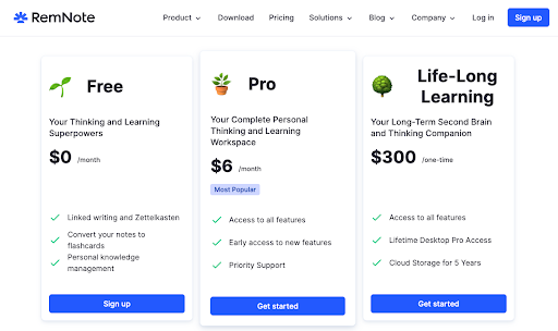
Source: remnote.com
Product Details Refresher
In some cases — like when running PPC campaigns on Google or social media — your prospects could land on your pricing page without having learned everything they need to know about your product.
In these instances, not offering sufficient info about how your software works could harm conversion rates. Fortunately, however, something as simple as including a product details refresher element on your product pages could help circumvent this problem.
A quick look at Scott’s Cheap Flights shows how this brand incorporates this element into its web design by creating a couple of sections discussing the main benefits of the Elite plan.
The information provided in these sections is straightforward and sufficiently detailed. But it doesn’t go overboard. Instead, Scott’s Cheap Flights ensures that the data is presented in a comprehensible and accessible way and doesn’t create clutter but contributes to a seamless browsing experience.
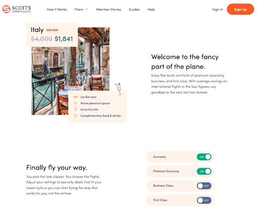
Source: scottscheapflights.com
Social Proof
Another high-value SaaS pricing page element you can add to your website is social proof.
Now, it’s true that social proof should be established on other, more suitable pages on your website. Nonetheless, adding some to the page where you’re most likely to convert customers is an excellent way to employ click-triggers, which are bound to increase the likelihood of people purchasing your product.
For instance, Lucidspark includes social proof on its pricing page by saying that it’s a product developed by the makers of Lucidchart, a software solution used by tech giants like Google, Amazon, Microsoft, and TMobile. Note how the proof is right next to the main CTA button, ensuring that it’s the last thing people see before deciding whether to click “Buy.”
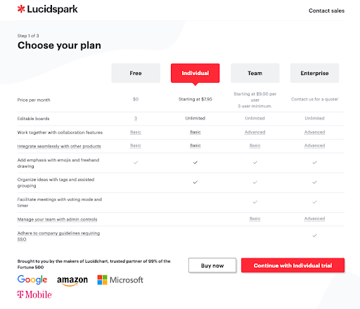
Source: lucid.app
Or, if you check out the pricing page, you’ll see that the brand includes a social proof element in the second screenful of the page, which lists successful customers and provides a quote from a satisfied client. While this may not have as direct an impact on conversions as the previous example, it’s still a great way to boost SaaS pricing page performance as it reinforces the fact that Toggle provides a high-quality piece of software.
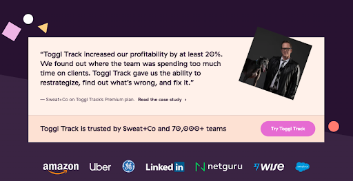
Source: toggl.com
An Appropriate Conversion CTA
Finally, as you explore the elements that will drive the success of your SaaS pricing page, don’t forget that, at the end of the day, the most crucial component you need to optimize is the CTA button.
Have you only got so much time or money to spend on improving your website’s performance? If that’s the case, you can rest assured that investing in CTA button optimization will deliver exceptional returns.
When optimizing your pricing page CTAs, there are two directions you can choose.
On the one hand, you could work towards converting as many leads as possible by repeating your CTA buttons in highly-noticeable areas and minimizing the number of interactions between the web visitor clicking the button and them becoming your customer.
This is what brands like Figma do. This particular business’ pricing page has a total of eight CTA buttons inviting prospects to sign up, get started, or choose a plan. And what’s genius is that clicking every single one results in a popup that allows web visitors to start using the software by providing an email and choosing a password (or, for a quick sign-up process, creating an account via Google).
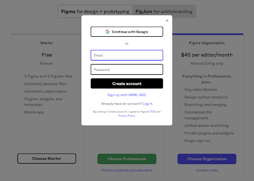
Source: figma.com
Or, if you know that you offer a complex product (and are aware of the fact that 52% of SaaS buyers want customized offers), you could pull back a bit on the sales-y language.
For instance, Affinda understands that its potential customers’ buyer’s journey doesn’t end upon seeing an offer but that they usually have additional questions. This is why the brand employs a “Speak to an expert” trigger, which encourages contact and provides the brand’s sales team with a unique opportunity to convert clients based on industry-leading customer service.
Source: affinda.com
Final Thoughts
There you have it, the most impactful elements of a successful SaaS pricing page you can add to your website.
Of course, not every business is the same. To get the most value out of these conversion drivers, you’ll first have to determine whether they align with your branding strategy, whether they’ll attract your target audience, and whether there are better strategies for you to try out.
And don’t forget: Whatever you decide, always make sure you test the performance of newly added elements to ensure you’re getting the desired results and to identify any quick fixes that might allow you to further increase your conversion rates on your site.
Thinking of Selling Your Business?
Get a free, individually-tailored valuation and business-readiness assessment. Sell when you're ready. Not a minute before.