Never Miss a Beat - Get Updates Direct to Your Inbox
Topics:
FILTER:
8 UX Principles That Drive Site Engagement and Boost Brand Perception
By Quiet Light
User Experience (UX) design is so much more than creating visually appealing interfaces — it’s about ensuring end users have a seamless, meaningful, and enjoyable experience when interacting with a website.
As a result, an exceptional UX design will result in boosting engagement and shape how website visitors perceive your brand.
This article will discuss eight UX principles to help you turn your website into a conversion powerhouse.
Your Site Visitors Don’t Want to Read
What’s a surefire way to scare your website visitors away?
Presenting them with a long-winded blog post, elaborate product page copy, or any other lengthy resource. In other words, forcing your audience to read will most likely get them to bounce off and look for a more concise vendor.
Good UX design means catering to your audience’s preferences and not expecting them to carve out more than a few minutes from their hectic schedules to learn more about your products or services.
You can achieve this by crafting short, engaging copy that succinctly encapsulates the benefits of your products. Start by identifying your potential customers’ main pain points and addressing them in a clear and compelling way. Then, illustrate how your solution can make all those issues go away. Don’t focus on product features and specifications, as these will only take up valuable real estate on the page without telling much about how the product will make a potential customer’s life easier.
But short copy is not the only way to accommodate your site visitors who don’t want to read. You can also offer them other content formats that are even more engaging and easy to consume, such as videos or animations. According to a study, 86% of video marketers say video has increased traffic to their website, and 84% say video has helped them generate leads.
Thanks to the combination of images, sounds, and movements, these mediums are more dynamic, interactive, and impactful than their text-based counterparts. Your audience won’t have to imagine how your product or service works — with videos and animations, they can see it themselves.
Besides allowing you to demonstrate how exactly your product can solve your audience’s pain points, visual content can communicate complex concepts in a simple manner, making it easier for people to grasp the core idea.
That’s exactly what BaseLang does on their homepage. Instead of using wordy copy to explain their service in great detail above the fold, they let the video, in which their happy customers briefly discuss their experiences with the platform, do the heavy lifting.
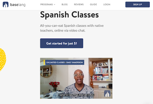
Source: Baselang
Speed Is More Important Than You Realize
We live in an age of immediacy, and this affects the way people interact with your website.
According to a study, excessive use of technology makes us more impatient, which means that your website visitors, who spend hours glued to their smartphones, tablets, and laptops, won’t tolerate underwhelming loading speeds. That’s why this metric has become one of the most crucial factors that affect website user experience.
The numbers say it all: 47% of people don’t wait for more than two seconds for a web page to load. Moreover, a one-second delay in page load time can result in a 7% drop in conversions and 11% fewer page views. This means that loading speed can directly impact the success of your website, especially if you run an ecommerce site or a blog that relies on ad revenue.
The math is clear — to avoid this worst-case scenario, you should optimize your website for speed and performance.
Here’s how you can do that:
- Enable browser caching, a technique that enables your website to store some of its files on the user’s device. This way, the user does not have to download them all over again whenever they visit your website.
- Implement a content delivery network (CDN) or a network of servers that deliver your website’s content to users based on their geographic location. This can reduce the distance and latency between your website and your users, resulting in faster loading times.
- Minify CSS and JavaScript files. These languages control the appearance and functionality of your website, but they can contain unnecessary characters, such as spaces, comments, or line breaks, that can increase their file size and, in turn, slow down your website.
To conclude, a fast-loading website results in a smooth experience for visitors, while sluggish loading speeds tend to frustrate and test their patience.
Nothing Showcases Your Product Better Than a Demo
Your every product page is like a digital storefront.
Its purpose is to invite potential customers to explore your product or service, familiarize themselves with it before deciding to commit, and deliver value at every touchpoint.
And what better way to showcase value than allowing users to experience your product firsthand? A well-executed demo is like offering them to take your solution for a spin and learn more about its core capabilities.
A demo can contribute to the overall user experience on your website in many ways:
- Increasing trust and credibility
A demo can show your visitors that you are confident and proud of your product. This kind of transparency proves your product works as advertised and delivers on its promise.
- Translating features into benefits
It’s much more effective to sell benefits than features, so a demo is a visceral way to make this transition. For instance, telling your prospects that your software has an intuitive and easy-to-use interface is one thing. Letting them see it in action is something entirely different.
- Educating and informing
With a demo, you can teach your prospects how to use your product, make the most of it, and use it to achieve their goals. Besides, this tactic allows you to answer their questions and address any potential objections they might have.
- Breaking down complexity
Acting as the ultimate icebreaker, a demo can be greatly beneficial for complicated products with a steep learning curve. It walks potential customers through intricate processes in a manner that eliminates intimidation and helps them understand how the product fits into their lives or solves their specific problems.
eTraining takes the concept of a demo to the next level by offering five-minute previews of all their courses so that their prospects can see what they expect if they decide to enroll. All demos are grouped based on different categories and can be easily accessed from the course catalog page.
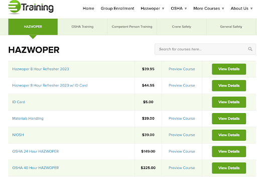
Source: Etraintoday
Negative Space Highlights Important Brand Messages
Less is more when it comes to UX design.
In an attempt to make your website more usable and informative, you can fall into the trap of turning your interface into a visual cacophony, preventing your website visitors from understanding what your solution is all about.
The trick is to embrace simplicity, which is a cornerstone of good UX design. Such a minimalist approach, embodied in the strategic use of negative space, will make the most crucial elements of your website pop. The first step is dropping the notion that every inch of a web page must be filled to the brim with content, visuals, or calls to action.
Negative space isn’t just an aesthetic choice but a powerful tool to make your brand message stand out. Psychologically speaking, our brains are hardwired to organize complex information into recognizable, coherent, and logical patterns. Visual clutter overwhelms the brain, making it difficult to process information effectively.
White space acts as a cushion that eliminates distractions, thus giving website visitors some breathing air and helping them focus on the essential parts of your message.
Besides being easy on the eyes and helping you highlight a compelling headline, product image, or call to action, negative space also improves the readability of your copy and adds a sense of balance to your layout.
The Vivion homepage is a great example of leveraging the power of negative space to create a smooth visual flow and accentuate the brand’s value proposition. There’s not too much text, and potential customers can find the product category or information they’re looking for at a glance.
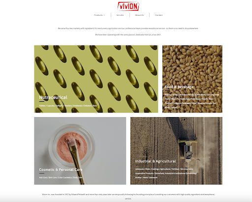
Source: Vivion
Although associated with vast, empty whiteness, negative space doesn’t have to be devoid of colors or images. In fact, it can incorporate colors, textures, images, or even subtle patterns, provided they don’t distract your visitors from the key page elements you want them to focus on.
Uber Eats doesn’t refrain from using a splash of yellow and food imagery on their homepage without taking away anything from its main purpose — inviting people to sign up and use their food delivery service. Call-to-action buttons are conspicuous, and negative space, although colorful, manages to accentuate them and subtly encourage visitors to take action.
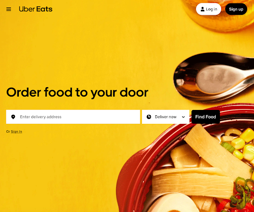
Source: Uber Eats
Search Result Pages Aren’t Always Necessary
A search bar is a staple element of successful UX design. You don’t want to expose your potential customers to endless browsing while they’re looking for a product they need, so allowing them to narrow down their search is a must.
However, here’s a thought: is it a good idea to whisk them away to a whole new search result page? The truth is that this can lead to unnecessary friction in the user journey, increasing the chances of distracting your potential customers and getting them to bounce off your site.
What you should do is optimize your search bar and maximize its role in the process by eliminating this extra step. Let’s analyze the anatomy of this more effective and user-friendly search functionality.
- Use a dynamic drop-down list and show results directly within the search bar in real time as the potential customer types. This way, they don’t have to wait for the results page to load, providing them with quick answers and instant gratification.
- Enrich the results further by incorporating images and pricing information. A text-only result may be informative, but an image brings it to life, and pricing information adds another layer of immediate relevance. This combo speeds up decision-making, as it lets users gauge products or services in a snapshot without having to click through to another page.
- Implement intelligent algorithms that will prioritize the results based on user behavior or popular searches and display only the most relevant items. Otherwise, you risk overwhelming potential customers by showing them a long drop-down list they can’t make sense of.
Dress Forms USA checks all the boxes with their interactive search bar, which displays search results together with product images and prices. Such an intelligent solution allows their customers to explore the brand’s products much faster and easily find the item that fits their needs and budget — without having to click back and forth.
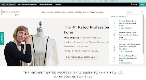
Source: Dress Forms USA
Your Site is Attracting More Mobile Users Than You Might Think
Assuming that most users access your website from a desktop is a misstep that could cost you significantly in terms of user engagement and conversions. With almost 60% of the web traffic coming from mobile devices, it’s evident that you have to adapt your UX design strategy to account for all the prospects using their smartphones or tablets to explore your products or services.
Here are some best practices to consider when optimizing your website for mobile audiences.
Responsive design is the least you can do.
A responsive design that adapts to different screen sizes is the bare minimum you should offer. But don’t settle for “it fits.” Ensure that the design is also intuitive and visually pleasing on smaller screens.
Speed matters big time.
Mobile users often search for quick answers on the go, meaning every millisecond counts. A slow-loading mobile site is an immediate turn-off, so it’s essential to go for simplicity. Do this by reducing the image size and watching out for bloated code.
Simplify navigation.
A complex menu that works on a desktop won’t cut it on mobile. Opt for a simple, thumb-friendly navigation menu. The fat-finger error can be really annoying, so make sure to use large buttons your visitors can tap on easily. Hamburger menus or bottom navigation bars are popular choices for a good reason — they work.
If you check out MarketBeat’s Compound Interest Calculator mobile page, you’ll see that it follows all the golden rules we discussed. Mobile visitors won’t have difficulty navigating it, entering data, and interacting with the calculator. The brand opted for a large, legible font so their audience doesn’t have to squint trying to make out what the copy says.
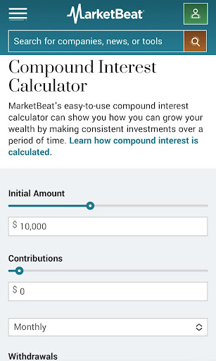
Source: MarketBeat
Walls of Text Alienate Your Site Visitors
Attracting qualified traffic to your website is challenging, but even after you achieve this, you’ll be faced with a sobering reality check: Your visitors will leave in a snap if you greet them with impenetrable walls of text.
These large blocks of text with little or no formatting, such as paragraphs, headings, bullets, or images, are hard to read, scan, or understand. Naturally, such visually unappealing content only discourages visitors from engaging with it.
If we bear in mind that people don’t actually read word for word online but rather scan or skim, it’s clear that not paying attention to the way you format your content is a huge UX design faux pas.
So, if you want to drive engagement, you should knock down these walls of text. Here’s how you can do that:
- Use subheadings to break the text into digestible chunks and offer visual cues about the content. Make your subheadings descriptive and intriguing to guide the reader through your article and keep them engaged.
- Split your content into bullet points and numbered lists to make complex information easier to grasp. They also offer visual relief, making your text more scan-friendly.
- Organize your ideas into short sentences and paragraphs. Concise paragraphs and sentences are easier to read and less intimidating than long, complex structures.
- Include images, charts, graphs, and other visuals to make your blog posts easier on the eyes, illustrate your points, or visualize data or trends.
Eachnight’s comprehensive guide on the best firm mattresses in 2023 is a lengthy read, and yet it’s formatted in a reader-friendly way. Every section starts with a box containing a quick recap of the best product in the category so that readers can easily skim it and get all the relevant information without having to go through the entire piece to find the product that fits their needs.
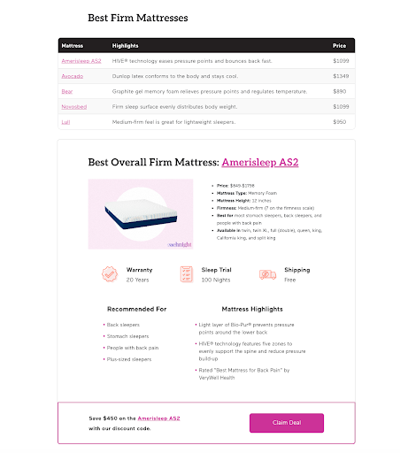
Source: Eachnight
Your Shoppers Want an Easy Way to Compare Prices
Ecommerce platforms can take a cue from the SaaS industry when it comes to simplifying the price comparison process. SaaS companies excel in laying out pricing options on a single page, highlighting features, and making it incredibly easy for prospects to compare plans and pick the one that suits them best.
Many ecommerce sites, especially those with extensive inventories, often fall short in this department.
When customers want to compare prices on an ecommerce website, they often have to switch between multiple tabs or windows. This need to juggle hampers the user experience, creates friction, and ultimately impacts conversion rates.
For platforms that offer customization options, the issue is even more complicated. Customers find it difficult to determine how different add-ons or modifications affect the price, thus making it difficult for them to decide.
For example, if you look at the home solar kits page on ShopSolar you can see they solved this problem by allowing customers to filter products from the same category and then select different customization parameters to check how much each configuration costs. This kind of comparison gives customers the possibility to see their options transparently and make an informed decision.
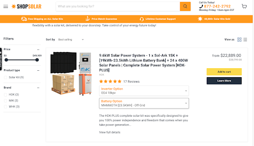
Source: Shop Solar
In Conclusion
Every $1 invested in UX results in a $100 ROI, so it’s safe to conclude all your efforts to improve user experience on your website will be worthwhile. These eight principles can point you in the right direction, and most of them are low-hanging fruit. When you go the extra mile to delight your audience and deliver an exceptional user experience, they will reciprocate with their loyalty.